24 May 2010

Finishing the books

Today I wanted to finish all my books, so I went into screen printing and made the cover for the lucky routines book:

I decided to keep it really simple, just print the 'Good Race' onto white card, because I didn't want to have a really long title about lucky race routines for a good race, and because the GOOD RACE = is the background on every page, it makes sense to have it on the cover as well, and also means that the viewer knows that the yellow writing behind the formula says GOOD RACE =, sometimes it isn't so easy to read. By just having this as the cover, it doesn't give too much away about whats going on inside the book, so to make sure the viewer gets whats going on, I screen printed this sub heading on the first page:

This way I can make sure that the viewer fully understands what the book is about and because it says 'lucky pre-race routines,' it links it to the other books.
I also completed the cover for the cutouts book. When i had a tutorial a couple of weeks ago, Rob said he liked the idea of having the cover as one of the explanations, 'All the best footballers are 9 or 7' was my favourite, it sums up my 9 year old brothers thinking into lucky numbers perfectly, so i thought it would be good on the cover, its also intriguing, in that it doesn't give anything away. I made the cover as a cutout, it just wouldn't have made sense to switch processes for the cover, just like I made a screen printed cover for the screen printed book; so even though the cutout is a really delicate thing, I wanted to make sure it worked on the cover. I used a dark purple cartridge paper for the cover, if it was just in white, the cutout wouldn't stand out against the white pages behind it or be very legible...

I liked how the sub-heading first page worked on the screen printed lucky routines book, so i decided to use this idea again for the cut-out book, I added a sheet of pale pink tracing paper as a first page and Letraset-ed on "It's my lucky number because.." as a little simple explanation of what the book is about and again linking it to the other books, because its important that the three of them work together as a set.

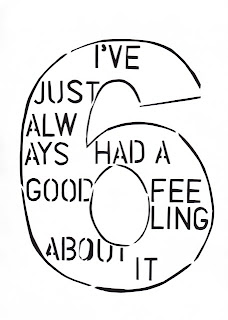
And finally, I made made the cover for the text nmbers book. As I'd made the whole book using letraset, I wanted to make a Letraset cover. At the weekend I tested some ideas for the cover..

I thought about making a text number out of an explanation about the book instead of an explanation about a lucky number, but then thought this might be giving a bit too much away and might make the inside of the book not as interesting when its opened. So i decided to switch the process around, and instead of making numbers out of words, make words out of numbers. So I made a really plain cover, that sums up what the whole book is about in one word (made of numbers..)

I sewed all three of the books together, it feels really good to have them all complete in a set!

22 May 2010

Making cutout numbers book

I previously made a cutout numbers book as part of my experiments in how to present the information I'd collected and photos I'd taken. Before i started to make the final cutout book, i went back and looked at the previous one, and what I'd written on here about ways in which i needed to improve it. I chose to make the book using cartridge paper, so i could easily print the photos onto it and also easily cut through it. I worked out the page layout and printed the photos onto the paper, the photos have a sort of grainy look to them because they're printed onto cartridge paper, but i don't mind this, i think it just softens the photos a bit and fits a bit more with the whole handmade process of the book. I've got 8 photos & explanations in total. I then stenciled the explanations onto the pages and I've started the cutouts:

I'm going to make sure I'm centering the cutouts on the page, something I picked up on from making the trial book.

18 May 2010

Lucky routines book

I had decided that one of my three final outcome books was going to be based on the lucky routines that i collected from the running club questionnaire, but wasn't sure on the format to work in. Then after the other day's screenprinting practice I decided I would go ahead and try to make the book out of screenprints, because i was pleased with how the overlapping text had turned out.. it made the formulas a lot more interesting. I decided to stick with the same 'GOOD RACE=' behind each formula, because behind every good race is a lucky routine, and then use different colours for each person's routine.

I'm really pleased with how this has turned out, I like how the 'good race' is a familiar thread that runs through the book and the different colours help to make each person individual, just like their personal lucky routine. I really enjoyed the process of screenprinting as well, each page is printed differently and not exactly central.. which I'm not worried about because that's what makes it an individual handmade book! These are some of the pages at the moment:

Making these three different books is enabling me to try out a range of processes which are becoming successful in their own ways. What i do want to make sure though is that the three books do look like they are part of the same project, i don't want them to look randomly placed together. To make sure this doesn't happen I'm going to have to think about the covers, maybe I could use the exact same paper/colour for the covers, to make them look like a set... this is something I'm going to think about over the weekend whilst I'm working on the next and final book, the lucky number photo cutouts book.

I Also managed to get hold of some smaller sized Letraset, not Helvetica but Charlotte Sans 3mm, and I think it works well with the bold Helevetica 'numbers,' because it's very subtle and doesn't detract from the numbers which was really important to get right.

17 May 2010

Text numbers book

Today I am working on putting together one of my final outcomes books, the text numbers.
I have worked out the sequence of the numbers that i want, and have been tracing the numbers onto the pages...

A good few hours later and I've completed the numbers..


I'm pleased with the outcome, they look good a set. I had to be really careful to make sure the text fitted into the shape of the numbers, sometime its gone a little bit over the length of the number.. but i don't think this is really noticeable. Now i want to put in the bottom right hand corner the person's name & age. I think it will put their lucky number and quote in a bit more of a context, and show that these lucky numbers come from actual people! At the moment though I'm not sure what letraset to use, I've used uppercase Helvetica 5mm for the numbers, but the lowercase in the same type will be too big.. i want the names to be quite subtle in the corner and not detract from the numbers. I've got some Times New Roman in 3mm but I'm not sure about mixing the two types together. I'm going to wait and try and get hold of some Helvetica 3mm tomorrow and then the dilemma will hopefully be solved!

14 May 2010

Final outcomes plan

I had a tutorial with Rob and we discussed my ideas for final outcomes. Because i was pleased with the lucky numbers photos book, and thought that the photos and the quotes about people's lucky numbers looked good together in sequence, we decided that it would make sense to create a series of books for my final outcome. I am going to make 3 books,
1 = Lucky numbers photos with cutout explanations.
This i have trialed already, but when i make the final one i need to think about not just sticking the photos onto the pages of the book, but having them printed onto the pages and also about the cutout explanation font/size etc. I'm going to use more photos in the final one as well, in the trial book there was only 4.
2 = A book just of the numbers made out of text, that I've practiced with number 6 'I've just always had a good feeling about it.' This is going to be on white paper, very clean and simple, using Letraset to write the text. I chose to make a book of these text numbers because this was the technique that i thought worked best in my experiments of combining the numbers & the explanations, because it was the most successful visually and also the process is one that can work for every number.
3 = Lucky routines. This one i still need to work out the format.. I think I'm going to have one page = one person, and have their lucky routine on that one page? Once i have completed one of the other books I can then concentrate on planning this one.

13 May 2010

Screenprinting

Today i carried out a number of tests using screenprinting for displaying the lucky routines I collected from the members of the running club, here are a few examples...

First of all I just experimented with the formulas by themselves and then I started to overlap the text, which I like because it links with the whole idea that behind a good race is an individual's lucky routine.

12 May 2010

Working with numbers & explanations

I decided to carry out some testing into what I could make using just the numbers & explanations and not the photos. I just used Becca's lucky 6 and her explanation - "I've just always had a good feeling about it." and trialed a few different ideas:

I used Letraset, cutouts and printouts to make these. I like the cut out one because it uses the shape of the number, but I think my favourite is the one of the three sixes, made from text. I like how the text becomes the number itself, combining the number & the personal explanation.

10 May 2010

Adding explanations & photos together

I've been experimenting with ways of joining the photos of people with their lucky numbers/ charms and their explanations of why they are lucky to them. This is really important, because its the people's explanations that makes the project interesting. The explanations have got to blend in with the photos, i've got to really make sure it's known that they come as a pair.
I've been experimenting with ways in which I could do this,
I started with Becca's number 6, I stenciled the letters onto the photo and then cut them out. I like how the explanation is in the photo, but the problem is that the cutout looks really messy on the glossy paper. The shine on the paper gets scratched off when you cut it with a scalpel so it looks like the letters have been ripped out when you look up close.


I then experimented with Katryns lucky charm, simply using Letraset to add her explanations:


I like the simplicity of this, the Letraset fits in well with the photos because its quite soft, especially on the bottom photo of just the charm, the writing looks quite delicate.The problem I have with this now though, is that I think the photos look better when they are grouped together, espcially the numbers photos. The cutout explanation on Becca's photo look pretty random as just a single photo, I think the photos need to be seen in sequence all together so the concept makes more sense to the viewer. So because of this, I started to sample ideas for presenting the photos in sequence.
I first simply arranged the photos and then used Letraset to write the short explanation quotes underneath:

This works better, the photos make more sense in sequence and the captions underneath easily explain the concept when you see them all together.
Because I've been thinking a lot about sequence, I got onto the idea of books. I've really enjoyed working in book form previously on foundation, and I think this is the perfect way to display the set of photos. I worked out the layout for my book using one piece of A2 paper.


I want to have the captions on the page before the photo. I experimented with methods of presenting the captions through a worksheet, and I decided that cutouts would work best for this, because I again I want to captions to work with the photos, so by using cutouts on caption page, you'll be able to see through to the photo on the next. This is the book, (without a cover at the moment)

I'm pleased with the outcome of the book, the cutouts works well to combine the photos and the explanations, but there are some things i need to think about changing... such as the fact that the photos are just stuck onto the pages, it would look much better if they were printed onto the actual book pages. Also the cutouts aren't central to the page, so you can't really see much of the photo behind them. I've only used 4 photos as well, i really would want a lot more pages, at the moment it seems a bit brief and doesn't really make much of a point by just using 4 people.