23 Mar 2011

Pick Me Up' 11

The second graphic arts fair at Somerset house was just as good as the first one!


18 Mar 2011

Sticky Tape

On tuesday night I went to the design museum, they had a one-off late night opening. Designers Numen/For Use had created an amazing huge sticky tape installation that you could walk inside. They had used 156 rolls of sticky tape.. 10.3 km!


Mini mock up of another tape installation:

17 Mar 2011

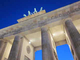
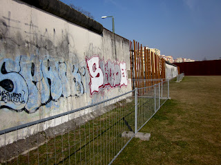
BERLIN

Photos from a recent uni trip to Berlin, we visited design studios and got to explore the city

16 Mar 2011

Wow

Pocket Archive triangle project

This was a project was started months and months ago, it was meant to test our ability to continue research and development over a really long period of time. We chose really random subjects that we could explore in great detail and try and visually communicate something. My subject was triangles, some pages from my sketchbook..


After a lot of research and not being sure what to do with it, I had a tutorial and was discussing ideas about patterns and shapes and had a lightbulb moment of, Kaleidoscope! It uses mirrored prisms to create endless patterns. So I took some photos of the inside of a kaleidoscope..


During the project I had researched typography made from triangles and this was something I wanted to do, so for my final piece I cut out the kaleidoscope photos into triangles and arranged them in type. 'Kaleidoscope' comes from the greek phrase 'to view a beautiful form,' so that is what I wrote in the type that I made in order to sum up what I was trying to show..


Manifesto for sustainable design

Working in groups of 3 we had to write and then visualise a manifesto for sustainable design. We found articles in old issues of Creative Review magazine about sustainable design and we got some really interesting information from them, one thing that caught our eye was the fact that blue ink is more sustainable than any other colour. We decided that we would try and make 'Blue the new Green.'

The points of our manifesto:
We are stuck in the universal template of always using black ink.
Black may be cheap but it is not the sustainable option.
Blue pigment has the least environmental impact.
Natural clay is the raw material of blue pigment and it is heavy metal free.
Blue pigment is non-toxic and safe to put back into the earth.
BLUE IS THE NEW GREEN.

We deliberated for ages over ways to present our manifesto, we started off by screenprinting posters and small envelopes that had the manifesto printed inside. (Using screenprinting as a more considered, sustainable printing process..)


We decided that we could be more eco friendly by tackling the problem of black ink before it is printed and thought about how we could make people see our message before they click print. We are now looking at screenbased templates and use the space around printed text or on top of it, trying to get the points of the manifesto in the way and noticed. Something like this maybe we'll have to see..