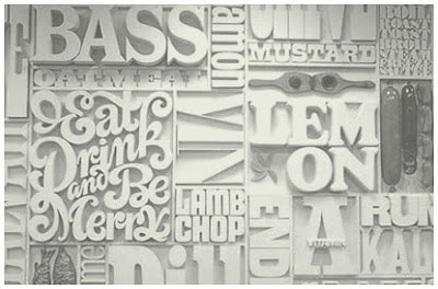
One of them we found at theKemistry Gallery, it was Lou Dorfsman's Gastrotypographicalassemblage. Just the name in itself is pretty impressive. It was designed and created for the CBS Cafeteria in 1965. Dorfsman mapped out a selectionof different typefaces, spelling out the food on offer in the cafeteria. The letters were cut out of wood and sprayed white to unify them. The result was a 40 foottypographic mural.
Original sketch:


Things we saw when just walking around Shorditch:


I like how some joker graffitied 'break' on the building underneath of 'TEA,' you can only see it from this angle as well.

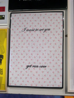
Little exhibition we found in a random street that was part of the Anti Design Festival

This alphabet was cool, but its missing a W.. don't know if that was to make it fit more nicely on the page, or if there was some meaning behind it?


And we also went to Emerge, which is a platform for selected graduates from all different graphic design BA courses to exhibit and get their work out there.
This was one of my favourite pieces, its a typeface made from people with glow in the dark arms forming the letters, it looked so effective when you saw them all together.


