10 Jan 2011

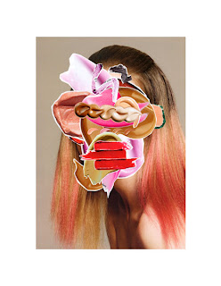
Bertrand Fevre's Porcelain Sculpture


Ludovica Gioscia

works in animation, sculpture, illustration, installation, I just saw some of her work on Its Nice That's blog.


Seeing and Reading

We did a typography project concerned with the difference between seeing and reading type. Working in pairs we had to design and make a leaflet and an A1 poster for an exhibition of the artist Rachel Whiteread's work at Tate Britain. We were inducted in and had to use Adobe Indesign. Rachel Whiteread's work is mostly concerned with negative space, so this was a running theme through our design.
Our leaflet,

22 Nov 2010

Universal Principles of Design Project

These two pages are A2 layout spreads for a magazine. This was a 4 day project, we were given 10 things/places/spaces and had to organise and present information about them. My group was given countries.. Wales, Liechtenstein, Czech Republic, Switzerland, Russia, Japan, France, USA, Macedonia and Hawaii (which isn't a country but oh well.) We started off looking at them typographically and then started moving into images.
The first type spread is the countries in point size, one point = 10,000km.
And on the right hand side is the population density of the countries in relation to letterspacing.

We asked members of our graphics class to draw our 10 countries on a map that was blank apart from the UK. we got some very interesting results, and in this spread we overlayed 12 of them so you can see the differences. The coloured circles are the actual location of the countries.


The third spread we made is still a working progress, its all about the amount of google hits each country gets, made into some sort of map.

EDIT - new 3rd spread..

17 Nov 2010

Swing, Punch & Emboss Machine


This was a group project in which we had to produce a Drawing Machine incorporating three verbs. We were given, Swing, Punch and Emboss. We had to produce a film explaining how our machine was made and how it works.

12 Nov 2010

Everyday Objects Project

We were set a one week project to transform/rework/re-contextualise an everyday object. My group was given bin bags. We spent the first few days playing around with our material and brain storming ideas. We liked the idea of quantity.. one bin bag on its own is a very thin and flimsy piece of material but as soon as you start plaiting it together it can be ridiculously strong. So we made a lot of rope.. Also on the labels of bin bags they always tell you how many litres (of air) each bin bag holds.. but we thought what if this could be litres of water?

Our final idea was an instillation type piece, we filled bin bags with litres of water that made up a daily routine of water usage and waste. 1L of water weighs 1 killogram, so they weighed an absolute tonne, but we had our strong bin bag ropes to suspend them from the ceiling with. It was a long day setting up the bags and hoping that the hooks we'd superglued into the ceiling didn't give way and send water splashing everywhere in the middle of the crit.


The end result was quite powerful, it gave people the opportunity to actually see the volume of water they use in a day and make them consider it. The idea of bin bags immediately links to the idea of waste so we decided that the concept was clear, but the bags needed labelling with the amounts and the daily routine.. 'brushing teeth' 'washing up' etc. We tried to keep the labelling as simple as possible and using a language that was connected to our material. We had seen bin bags with tick boxes and bold text to identify what was inside so we used that for our labelling.
.

4 Oct 2010

Gastrotypographicalassemblage & other cool things from the London Design Festival

I'm now at Kingston, living in university halls in Surbiton. Having an amazing time, and its so great to be living sort of in London but sort of out of it, we've got the best of both here. When the London Design Festival was onlastweekend, i went up into central with a group of classmates and we explored the Shorditch/ Brick Lane area. None of us had ever properly been around that area before, so we took a whileto find stuff, but when we did there was some really really interesting work on show in small galleries and shops as part of the design festival and the anti design festival.
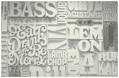
One of them we found at theKemistry Gallery, it was Lou Dorfsman's Gastrotypographicalassemblage. Just the name in itself is pretty impressive. It was designed and created for the CBS Cafeteria in 1965. Dorfsman mapped out a selectionof different typefaces, spelling out the food on offer in the cafeteria. The letters were cut out of wood and sprayed white to unify them. The result was a 40 foottypographic mural.

Original sketch:


Things we saw when just walking around Shorditch:


I like how some joker graffitied 'break' on the building underneath of 'TEA,' you can only see it from this angle as well.


Little exhibition we found in a random street that was part of the Anti Design Festival


This alphabet was cool, but its missing a W.. don't know if that was to make it fit more nicely on the page, or if there was some meaning behind it?


And we also went to Emerge, which is a platform for selected graduates from all different graphic design BA courses to exhibit and get their work out there.
This was one of my favourite pieces, its a typeface made from people with glow in the dark arms forming the letters, it looked so effective when you saw them all together.

24 May 2010

Finishing the books

Today I wanted to finish all my books, so I went into screen printing and made the cover for the lucky routines book:

I decided to keep it really simple, just print the 'Good Race' onto white card, because I didn't want to have a really long title about lucky race routines for a good race, and because the GOOD RACE = is the background on every page, it makes sense to have it on the cover as well, and also means that the viewer knows that the yellow writing behind the formula says GOOD RACE =, sometimes it isn't so easy to read. By just having this as the cover, it doesn't give too much away about whats going on inside the book, so to make sure the viewer gets whats going on, I screen printed this sub heading on the first page:

This way I can make sure that the viewer fully understands what the book is about and because it says 'lucky pre-race routines,' it links it to the other books.
I also completed the cover for the cutouts book. When i had a tutorial a couple of weeks ago, Rob said he liked the idea of having the cover as one of the explanations, 'All the best footballers are 9 or 7' was my favourite, it sums up my 9 year old brothers thinking into lucky numbers perfectly, so i thought it would be good on the cover, its also intriguing, in that it doesn't give anything away. I made the cover as a cutout, it just wouldn't have made sense to switch processes for the cover, just like I made a screen printed cover for the screen printed book; so even though the cutout is a really delicate thing, I wanted to make sure it worked on the cover. I used a dark purple cartridge paper for the cover, if it was just in white, the cutout wouldn't stand out against the white pages behind it or be very legible...

I liked how the sub-heading first page worked on the screen printed lucky routines book, so i decided to use this idea again for the cut-out book, I added a sheet of pale pink tracing paper as a first page and Letraset-ed on "It's my lucky number because.." as a little simple explanation of what the book is about and again linking it to the other books, because its important that the three of them work together as a set.

And finally, I made made the cover for the text nmbers book. As I'd made the whole book using letraset, I wanted to make a Letraset cover. At the weekend I tested some ideas for the cover..

I thought about making a text number out of an explanation about the book instead of an explanation about a lucky number, but then thought this might be giving a bit too much away and might make the inside of the book not as interesting when its opened. So i decided to switch the process around, and instead of making numbers out of words, make words out of numbers. So I made a really plain cover, that sums up what the whole book is about in one word (made of numbers..)

I sewed all three of the books together, it feels really good to have them all complete in a set!