Today I wanted to finish all my books, so I went into screen printing and made the cover for the lucky routines book:

I decided to keep it really simple, just print the 'Good Race' onto white card, because I didn't want to have a really long title about lucky race routines for a good race, and because the GOOD RACE = is the background on every page, it makes sense to have it on the cover as well, and also means that the viewer knows that the yellow writing behind the formula says GOOD RACE =, sometimes it isn't so easy to read. By just having this as the cover, it doesn't give too much away about whats going on inside the book, so to make sure the viewer gets whats going on, I screen printed this sub heading on the first page:

This way I can make sure that the viewer fully understands what the book is about and because it says 'lucky pre-race routines,' it links it to the other books.
I also completed the cover for the cutouts book. When i had a tutorial a couple of weeks ago, Rob said he liked the idea of having the cover as one of the explanations, 'All the best footballers are 9 or 7' was my favourite, it sums up my 9 year old brothers thinking into lucky numbers perfectly, so i thought it would be good on the cover, its also intriguing, in that it doesn't give anything away. I made the cover as a cutout, it just wouldn't have made sense to switch processes for the cover, just like I made a screen printed cover for the screen printed book; so even though the cutout is a really delicate thing, I wanted to make sure it worked on the cover. I used a dark purple cartridge paper for the cover, if it was just in white, the cutout wouldn't stand out against the white pages behind it or be very legible...

I liked how the sub-heading first page worked on the screen printed lucky routines book, so i decided to use this idea again for the cut-out book, I added a sheet of pale pink tracing paper as a first page and Letraset-ed on "It's my lucky number because.." as a little simple explanation of what the book is about and again linking it to the other books, because its important that the three of them work together as a set.

And finally, I made made the cover for the text nmbers book. As I'd made the whole book using letraset, I wanted to make a Letraset cover. At the weekend I tested some ideas for the cover..

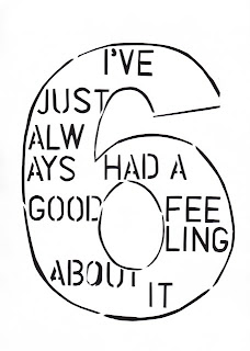
I thought about making a text number out of an explanation about the book instead of an explanation about a lucky number, but then thought this might be giving a bit too much away and might make the inside of the book not as interesting when its opened. So i decided to switch the process around, and instead of making numbers out of words, make words out of numbers. So I made a really plain cover, that sums up what the whole book is about in one word (made of numbers..)

I sewed all three of the books together, it feels really good to have them all complete in a set!